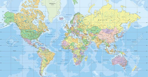
Take a moment and imagine a map of the World.
.
.
.
Did it look something like this?
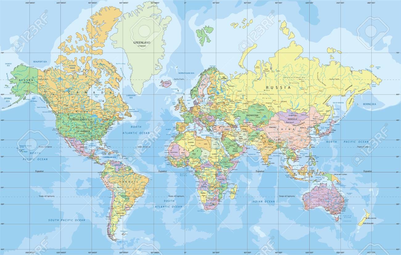
You’re not alone.
This view is called the Mercator projection. The original was created over 400 years ago by Flemish cartographer Gerardus Mercator. It fell in and out of prominence before becoming the de facto representation for web applications and American classroom lessons. It’s helpful for visualizing countries and political zones, but tends to distort sizes and distances.
The Mercator projection exaggerates locations that are far from the equator. Here is a helpful graphic to visualize just how inaccurately some countries are displayed compared to their true size.

The Mercator is great for memorizing countries. However, it’s not great for establishing an understanding of how the world is actually structured. A more realistic map of the world is the Gall-Peters, pictured below.
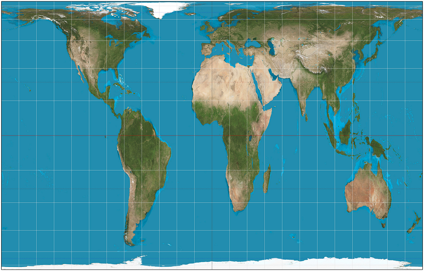
The first thing I notice is just how big Africa and South America are. Next, I notice that Europe and North America make up a relatively small portion of our planet, despite their outsized coverage in the news.
The Gall-Peters is useful to understand how countries are relatively sized. Like many maps, it accomplishes this effect by distorting the shapes of countries to fit neatly on a grid.
As a species, we imagine the world through stories and pictures that we experience. Very few people have the opportunity to travel and see the world for themselves. Less than 20% of the world has ever been on an airplane, and fewer still will travel internationally. Therefore, we rely on maps like these to shape our worldview. Understanding that these projections are just that — a projection, helps to break the illusion and provide perspective.
Want to see a few more?
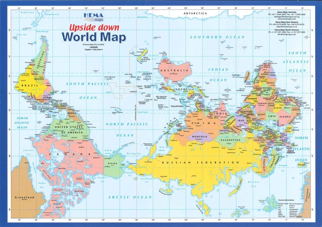
This view is unusual for Americans, who are used to seeing the United States as the focal point of the map. Yes, the map is upside-down, but it also “splits” the projection across the Atlantic ocean, rather than the Pacific. This lets us see the vast space between the Asian and American continents.
Speaking of the Pacific, notice how prominent it is? The majority of the map consists of open ocean, yet we tend to focus on the land and squabble over minor details.
There is another view of the World that splits our planet into two hemispheres: Land and Water.

These hemispheres are divided by taking the areas of Earth with the maximum area of land and water and creating two halves. Even in the “Land” hemisphere, the total area containing ocean exceeds that of dry land.
The Spilhaus projection is a more accurate depiction of reality:
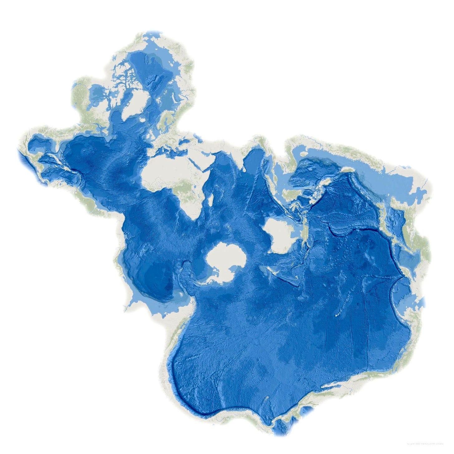
We live on an aquatic planet, no matter what we tell ourselves to the contrary.
The reality is that all of our conflicts, our religions, our hopes and dreams — they exist on a small fraction of the Earth’s surface. 70% of the Earth is ocean, yet our maps are entirely focused on accurately portraying invisible political zones and boundaries. This assumption has trickled down into our politics, economics, and businesses. I believe that there is unexplored potential in these unclaimed areas, available for the taking to anyone bold enough to try.
Over the next four weeks, I’m going to examine our relationship with the Ocean. Together, we will ask and answer questions like:
Why haven’t we settled the Oceans in the same way that we have settled Land?
What is preventing the formation of new countries with territories consisting entirely of water?
How difficult are the engineering challenges associated with living on the water, and who is best suited to taking these challenges on?
Where are the best places to live in the Oceans, and what would life there look like?
This topic is something that I’ve been considerably interested in since I discovered the amount of innovation that has gone unnoticed in this space. I consider this to be one of those big ideas that will seem obvious in hindsight; a recipe for disruption. If you have any stories, anecdotes, or people I should meet to learn more, I’d love to hear from you.
Before you go, I have one request. Sunday Scaries doesn’t have paid subscriptions yet. If you like it, the best way to show your appreciation is to spread the word.
By forwarding this email and signing up below, you won’t have to worry about missing anything. Every new edition of the newsletter goes directly to your inbox.
This newsletter is designed to teach you about what is going on at the intersection of technology and society, and how I think about the issues. Each week you’ll receive my top picks from the past 7 days, as well as videos, short stories, and interesting links to explore.
📚 Reading
It’s been nearly 30 years since the Voyager captured the famous image of the Pale Blue Dot.
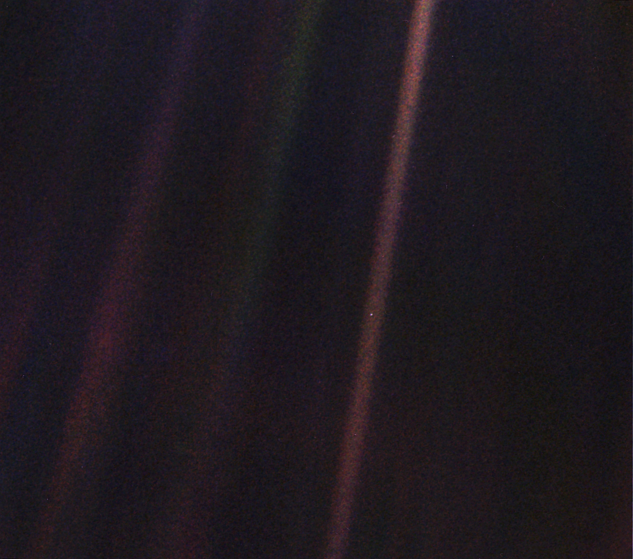
"Look again at that dot," Sagan wrote in his book "Pale Blue Dot." "That's here. That's home. That's us. On it everyone you love, everyone you know, everyone you ever heard of, every human being who ever was, lived out their lives. The aggregate of our joy and suffering, thousands of confident religions, ideologies, and economic doctrines, every hunter and forager, every hero and coward, every creator and destroyer of civilization, every king and peasant, every young couple in love, every mother and father, hopeful child, inventor and explorer, every teacher of morals, every corrupt politician, every 'superstar,' every 'supreme leader,' every saint and sinner in the history of our species lived there -- on a mote of dust suspended in a sunbeam."
— Carl Sagan, "Pale Blue Dot," 1994
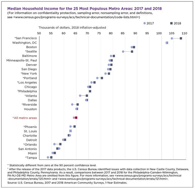
Why is Angel Investing so much more prominent in San Francisco than other places?
I’ve been toying with the idea of digging into the concept of “social capital” for a while. This post explains the reason why people are willing to part with large sums of money for less than guaranteed returns. The answer: to improve their reputation and open more opportunities for themselves. Even if the deal doesn’t work, it’s a conversation starter and a way to grow your network.
The median income in San Fransisco is significantly higher than the rest of the United States.
A conversation with Mark Zuckerberg, Tyler Cowen, and Patrick Collison on the science of progress.
Why do some fields experience more progress than others?
Does management training actually help?
How can we cure all diseases by the end of the century?
This powerhouse group of thinkers discusses these questions in an extended conversation produced by Zuckerberg’s newsroom as part of his yearly personal challenge. People forget that Zuckerberg does other things than Facebook. This interview shows a side of Zuckerberg that the public is just now seeing of Bill Gates.
A video of Richard Nixon giving a speech announcing the disaster of the Apollo 11 moon landing.
Except there was no disaster, and the speech is an uncannily realistic deepfake created by a team of researchers at MIT.
Fake videos are here, and we will need to develop systems to detect them before they have serious consequences. This is already happening in private WhatsApp groups, but we have yet to experience a mainstream hoax that has serious implications.
💎 Quote
“If you wish to build a ship, do not divide the men into teams and send them to the forest to cut wood. Instead, teach them to long for the vast and endless sea.”
Antoine de Saint-Exupery
⬇️ Follow me on Twitter and Medium.
Sunday Scaries is a newsletter that summarizes my findings from the week in technology. It's part soapbox, part informative. It's free, you’re reading it right now, and you can subscribe by clicking the link below 👇

